
Article: The Pleasure of Changing Your Mind

The Pleasure of Changing Your Mind
Ask someone what they would never have in their home and the answer often comes surprisingly quickly.
Florals. Bright yellow. Animal prints. Too much pattern.
We can be remarkably certain about things we've never actually lived with.
A particular colour might remind us of a room we disliked years ago. We may have always associated floral prints with a style that doesn't feel like ours. Or we saw something once, decided it wasn't for us, and never looked at it again.
These preferences become our own unwritten decorating rules.
And sometimes, they're worth questioning.

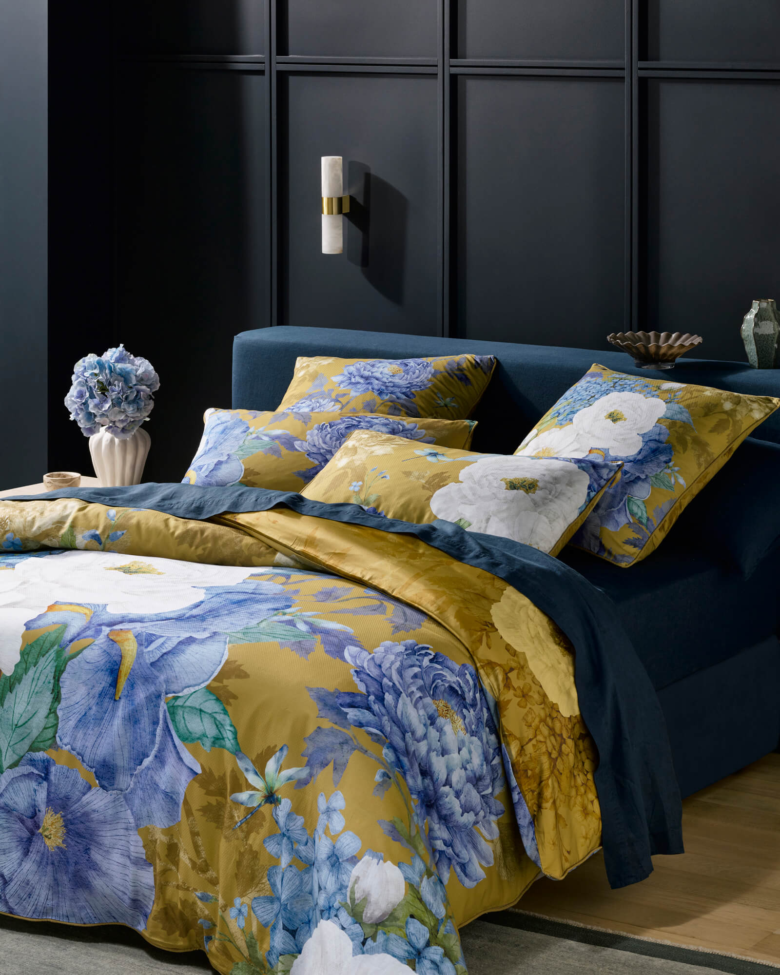
Marceline Mustard against deep navy panelling.
The things we've already decided
Most of us have a mental picture of what belongs in our home.
We know which colours feel comfortable, which furniture appeals to us and which patterns we would rather avoid.
There's nothing wrong with having preferences. They make choosing easier.
But a preference and a rule are not quite the same thing.
“I don't usually choose florals” leaves room for an exception.
“I don't like florals” closes the conversation before it begins.
The distinction seems small, but it can influence everything we allow ourselves to consider.
And sometimes the most interesting question isn't why we like something.
It's why we didn't think we would.
It may never have been the pattern
Take floral prints.
For one person, the words might suggest delicate roses and traditional interiors. For another, they bring to mind oversized tropical leaves, unusual colour combinations or botanical illustrations.
These are very different visual experiences, yet they all fall under the same description.
The same is true of stripes. Fine pencil stripes can feel precise and architectural. Broad, irregular stripes might feel relaxed and expressive.
Even a colour we think we dislike can change character depending on its surroundings.
Yellow beside white is a different proposition from yellow against deep navy. Black within a detailed botanical composition behaves differently from black across an uninterrupted surface.
Sometimes what we're rejecting isn't the colour or pattern itself.
It's the particular version of it we've come to associate with the name.
Looking before labelling
Consider Luxotic's Marceline Mustard.
It is, by any description, a floral, with large white blooms and blue irises painted against a deep mustard ground.
But look beyond the label.
The white blooms draw the eye first. Then the blues emerge, giving the composition another dimension against the mustard background. The scale of the flowers makes the design expressive, while the individual details reward a closer look.
From a distance, it reads as a bold floral. Up close, the relationships between colour, shape and painted detail become more interesting.
Someone who would normally say they don't like florals, or yellow, might still find themselves drawn to it.
Not because their taste has suddenly changed, but because this particular design offers something they hadn't expected.
The same goes for artwork, furniture and the objects we bring into our homes. Sometimes a closer look reveals something that the label alone never could.

Marceline Mustard, seen up close.
The exception that proves nothing
There is a temptation, when we discover something unexpected, to turn it into a new rule.
We might decide that we do like florals after all. Or that our home needs more colour. Or that we've been decorating too cautiously.
But one unexpected attraction doesn't have to become an entirely new identity.
You can love a particular floral design and still dislike most florals.
You can enjoy an expressive bedroom without wanting every room in the house to look the same.
You can admire something without needing to own it.
Taste doesn't have to be perfectly consistent to be meaningful.
In fact, some of the most interesting things we choose are the exceptions.

