The Role of Texture in a Well-Designed Bedroom
Walk into a room that works, one that makes you want to stay, that adjusts your mood within moments of crossing the threshold, and try to articulate what you are responding to. Colour, you might say. Light. The furniture. These are the obvious answers, and they are usually wrong, or at least incomplete. The quality you are actually responding to is more likely to be texture: the layered, multi-surface depth that distinguishes a room that has been designed from one that has merely been furnished.
Texture is the most underestimated dimension of interior design, particularly in bedrooms, and for a specific reason. It does not translate well to photographs. A flat image can convey colour, proportion, and arrangement with reasonable accuracy. What it cannot convey is the way a woven surface catches light differently at different angles, or the way a smooth fabric contrasts against a rough-hewn timber bedside table, or the quality of depth that comes from a room where every surface has been chosen with its material nature in mind. You experience texture in person. You feel it before you can name it.
This gap between what looks good in images and what feels good to inhabit is one of the more frustrating realities of designing a bedroom from a screen. Mood boards and product pages flatten everything into the same two-dimensional plane. A polyester quilt cover and a cotton sateen one look broadly similar in a thumbnail. In the room, at the end of a day, they feel nothing alike. Understanding why, and understanding how to use texture deliberately across the whole bedroom, is one of the more transformative shifts available to anyone who takes their domestic spaces seriously.
Why Texture Does What Colour Cannot
Colour creates mood at a distance. From across a room, a warm terracotta wall or a deep ink bedhead registers immediately, setting the emotional tone before you have moved any closer. Texture is different. It creates feeling at proximity. It is what you notice when you are actually in the space, when your hand moves across the bedding, when you are lying down and the fabric is against your skin, when the morning light catches the surface at an angle that reveals its weave or sheen or grain.
The difference between a room that looks good in photographs and one that feels genuinely good to be in is almost always a texture question. Rooms that photograph well but feel hollow in person are typically rooms where all the surfaces are the same kind of smooth. Painted walls, flat upholstery, a glossy floor, a bedding set that has been chosen for its colour rather than its material quality. Everything reads correctly from the doorway, but the room does not reward being in it. There is nothing to discover.
Rooms that reward occupancy are rooms where different surfaces behave differently. Where one thing is matte and another is lustrous. Where something rough sits alongside something smooth. Where visual depth and tactile depth reinforce each other. The eye moves through these rooms differently, finding new things at different scales and different distances. The body responds to them differently too, reading the material variety as warmth, as evidence of care, as a space that was considered rather than assembled.
Interior designers sometimes describe this as material conversation, the way different surface qualities speak to each other across a room. A stone bowl on a timber surface. A linen cushion against a leather headboard. Matte plaster walls behind a luminous sateen quilt. These pairings work not despite their difference but because of it. The contrast is what makes each surface visible. Without something to push against, texture becomes invisible.

Azura Selva Quilt Cover Set — close-up detail of the hand-painted hummingbird motif, showing how brushwork and the cotton sateen surface create tonal depth and visual texture at close range. Shop Azura Selva →
The Layered Bed as Textural Composition
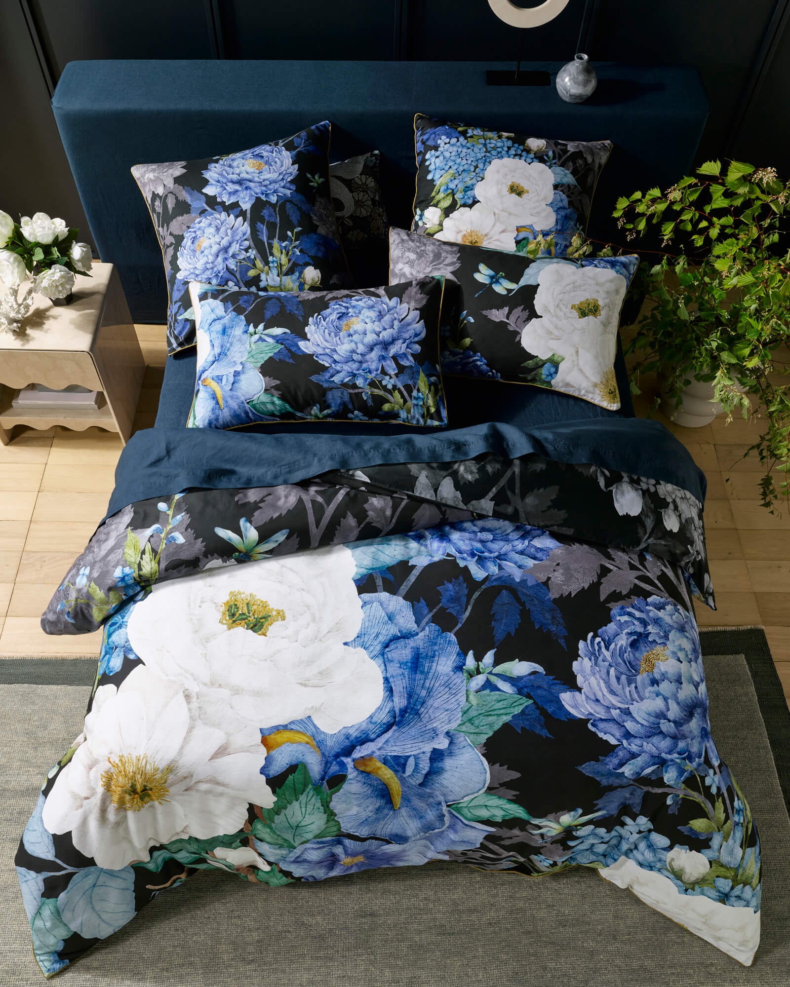
The bed is the largest single surface in the bedroom and the place where texture has the most to work with. This is partly because bedding invites proximity in a way that walls and floors do not. You are in contact with it. You see it from above and from the side and from across the room. You touch it twice a day, every day. The textural quality of the bed registers on every available sensory channel, which makes it the most expressive element in the room and the one most worth considering with care.
A bed that is dressed in a single fabric type, even a beautiful one, does not read as richly as a bed that has been layered. The base sheet is one surface. The quilt cover is another. The euro pillowcases, if they are a different weave or weight from the quilt, add a third. A throw across the foot of the bed, particularly if it is in a contrasting material such as a woven cotton or a lightweight knit, adds a fourth. Each layer has its own surface quality. Together they create the kind of depth that makes a bed look like something that was composed rather than just made.
This layering logic is not about adding more things for the sake of it. It is about the relationships between surfaces. The cotton sateen quilt cover, with its smooth weight and subtle sheen, reads very differently against a matte linen sheet than it would against a cotton jersey. The contrast is what makes the sateen's surface visible as itself, rather than simply as a background for the print. Textural interest comes from difference. A bed that is all one texture, however refined that texture might be, is a bed that the eye passes over rather than rests on.
What Cotton Sateen Brings to the Equation
Not all smooth fabrics are the same kind of smooth. This is a distinction that matters enormously in a bedroom, where the bedding is the dominant surface and its textural character sets the tone for everything else in the room. Cotton sateen occupies a specific position among smooth fabrics: it has weight, drape, and a surface that interacts with light in a way that is neither flat nor overtly glossy. It has luminosity. Which is a different quality from shine.
Shine, as found in polyester satin, is uniform and directional. The surface reflects light predictably, creating a high-sheen appearance that reads as slick rather than rich. Luminosity, as found in cotton sateen, is subtler. The surface catches light at different intensities depending on the angle of the viewer and the angle of the light source. A sateen quilt cover lit from the side looks different from the same quilt cover lit from above. The fabric seems to have an interior light source. In a well-lit bedroom, this quality adds an enormous amount to the room's atmosphere without requiring any conscious attention.
This matters particularly for printed designs, because the surface of the fabric is the medium through which the design is experienced. A hand-painted artwork on cotton sateen is not simply a pattern on a flat ground. The sateen's luminosity means the ground itself participates in how the design reads. Areas of the design where colour is lighter appear almost radiant against the lustrous surface. Darker areas deepen in contrast. The design has dimension that a matte fabric cannot provide, because the matte surface absorbs rather than returns the light that would create that depth.
For the LUXOTIC Signature Series, this relationship between design and fabric is not incidental. Each design began as hand-painted original artwork, and the decision to print on cotton sateen was made because the fabric's surface is the right medium for how the artwork needs to be experienced. The brushwork that creates tonal variation in the original painting is carried through into the fabric print, and the sateen's luminosity amplifies it. The result is bedding that behaves more like a painting than a product: that has depth, that changes with the light, that rewards looking at closely as much as from a distance.

Aria Black Quilt Cover Set — close-up of the peacock motif detail, showing how the hand-painted brushwork reads across the cotton sateen surface at close range. Shop Aria Black →
Pattern as a Form of Visual Texture
There is a distinction in print design that rarely gets discussed outside of specialist circles but that has enormous practical relevance for how bedding looks in a room. The distinction is between pattern as repetition and pattern as texture. The first is what most mass-produced bedding offers: a motif tiled across the surface at consistent intervals, producing an overall effect that reads the same at every point. The second is what hand-painted artwork produces: a surface where no two areas are identical, where the brushwork creates micro-variation in tone and density, and where the overall impression is not of a repeated unit but of a continuous field with internal depth.
Visual texture of this kind behaves like physical texture. It creates the impression of a surface that has relief, that you could run your hand across and feel variations in. This is partly why hand-painted designs on bedding read so differently from digitally generated ones even when the subject matter is similar. A digitally drawn botanical print has visual uniformity. A hand-painted botanical print has marks that were made by a brush held by a hand, and those marks carry the natural variation of that process. They do not tile. They do not repeat. They accumulate into a surface that is genuinely rich.
At different scales, this visual texture reads differently. From across the room, a design like Jungle Lotus reads as a deep, botanical ground, the overall impression of dense foliage and layered forms. Moving closer, individual elements separate out: lotus flowers, leaves, stems, the relationships between them. Closer still, the brushwork itself becomes visible, the marks that built the forms, the tonal layering that gave the design its depth. This is a quality normally associated with fine art rather than product design. It is what makes looking at a LUXOTIC design different from looking at ordinary printed bedding, and it is what makes the bed the most visually alive surface in the bedroom.
A hand-painted design does not just decorate the surface it is printed on. It gives the surface texture of its own — visual weight that changes with distance, that reveals different things at different scales, that makes the room richer the longer you look at it.

Gold Leaf Quilt Cover Set — close-up of the top left floral and avian motif, showing the tonal layering and brushwork of the hand-painted original. Shop Gold Leaf →

Jungle Lotus Quilt Cover Set — botanical detail showing the dense layering of lotus and foliage motifs across the sateen surface. Shop Jungle Lotus →
Building Texture Through the Room
The bed is the anchor. Everything else in the bedroom should be chosen with the bed's textural character in mind, not to match it but to support it, providing the contrast that makes the bed's material quality legible. This is a different way of thinking about furniture and surface selection than most people use, and it produces different results.
The most common approach to bedroom design is colour-led: choose a palette and select everything within it. The problem with this approach, when applied without reference to texture, is that colour-matching without textural contrast produces rooms that feel flat. A warm white wall and a warm white bedding set and a warm white rug all sit in the same tonal register and cancel each other out. The room appears unified but lacks depth. Nothing has anything to push against.
A texture-led approach keeps colour as a guide but adds the dimension of surface quality to every decision. The bedside table that is solid timber rather than lacquered. The rug that is woven rather than flat-pile. The cushion that is a matte linen rather than the same sateen as the quilt cover. These choices do not need to be dramatic. The textural contrast between a smooth cotton sateen quilt and a rough-textured bedside lamp does not require the lamp to be unusual or expensive. It requires it to be different in surface character from what surrounds it. That difference is what the eye reads as richness.
Negative space plays an equally important role. A bedroom where every surface is covered, where objects crowd every shelf and the bed is buried under decorative layers, loses the ability to make texture visible. Texture needs room. A single textural element, beautifully chosen, sitting against a plain surface is more effective than five competing textures fighting for the same space. The considered bedroom is not a maximalist one. It is one where each surface has been given enough room to be itself.
| Bedroom designed with textural thinking | Bedroom designed without it |
|---|---|
| Surfaces chosen for how they behave differently from each other, not just how they match | All surfaces selected from within a single material category, creating visual uniformity |
| The bed's sateen sheen reads clearly against matte walls and natural timber | The bed's surface blends into the room, its material quality invisible without contrast |
| 3–4 distinct textures in conversation: smooth, rough, woven, matte | One texture type, however refined, repeated across the majority of surfaces |
| Negative space preserved around key textural elements so they read clearly | Surfaces crowded with objects that compete for the same visual register |
| Room rewards occupancy: reveals more the longer you are in it | Room reads completely from the doorway, offers nothing further on approach |
The Tactile Intelligence of a Considered Bedroom
The bedroom is the room you touch more than any other. You move through it in the half-dark, your hands finding surfaces by memory. You spend hours in contact with the bedding. You reach for the lamp without looking. The tactile environment of the bedroom is not a secondary consideration to its visual one. For the time you spend in it, touch may be the more important sense.
This is the argument for choosing bedding with genuine material intelligence rather than simply for visual effect. A design that looks beautiful in a photograph but is printed on fabric that traps heat or feels rough against the skin produces a different bedroom experience than one that looks beautiful and feels, equally, like the best version of what bedding can be. The first is interior design as a visual performance. The second is interior design as a complete sensory proposition.
Cotton sateen sits at the intersection of these requirements because its surface qualities serve both the visual and the tactile. The smooth, lustrous surface that gives LUXOTIC's hand-painted designs their depth in the room is also the surface that is pleasant to sleep under, that regulates temperature, that does not scratch or pill or lose its quality after washing. The material and the aesthetic are not separate propositions. They are the same proposition approached from two different directions.
Choosing the bedding as the first and most important textural decision in the bedroom, rather than the last, changes the entire design process. When you know what the dominant surface will look like and feel like, everything else becomes easier to select. The wall colour, the bedside surfaces, the rug, the lamp: all of these find their place in relationship to the bed rather than in competition with it. The room that results is one that has a clear centre, a point of maximum richness and intention, surrounded by surfaces that have been chosen to make that centre visible. That is what a considered bedroom looks like. And, more importantly, it is what one feels like.
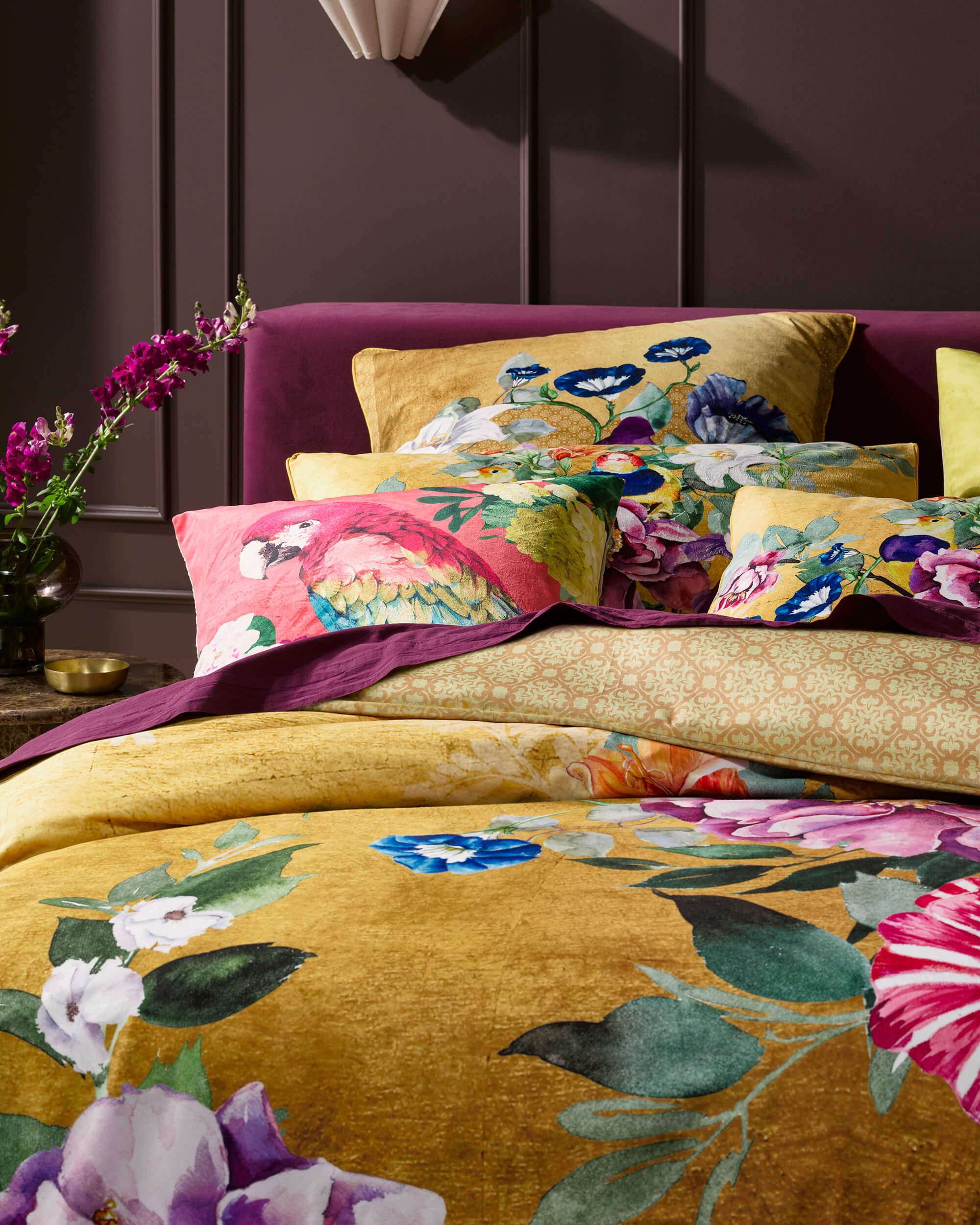
Azura Selva
A hand-painted tropical world of hummingbirds and botanical forms whose brushwork creates visual texture that shifts from across the room to up close. Rich in both colour and surface depth.
Shop Azura Selva →Aria Black
Layered motifs on a deep ink ground — a design of exceptional visual density that behaves differently at every scale, rewarding both the view from the doorway and the close inspection from the bed.
Shop Aria Black →Marceline Mustard
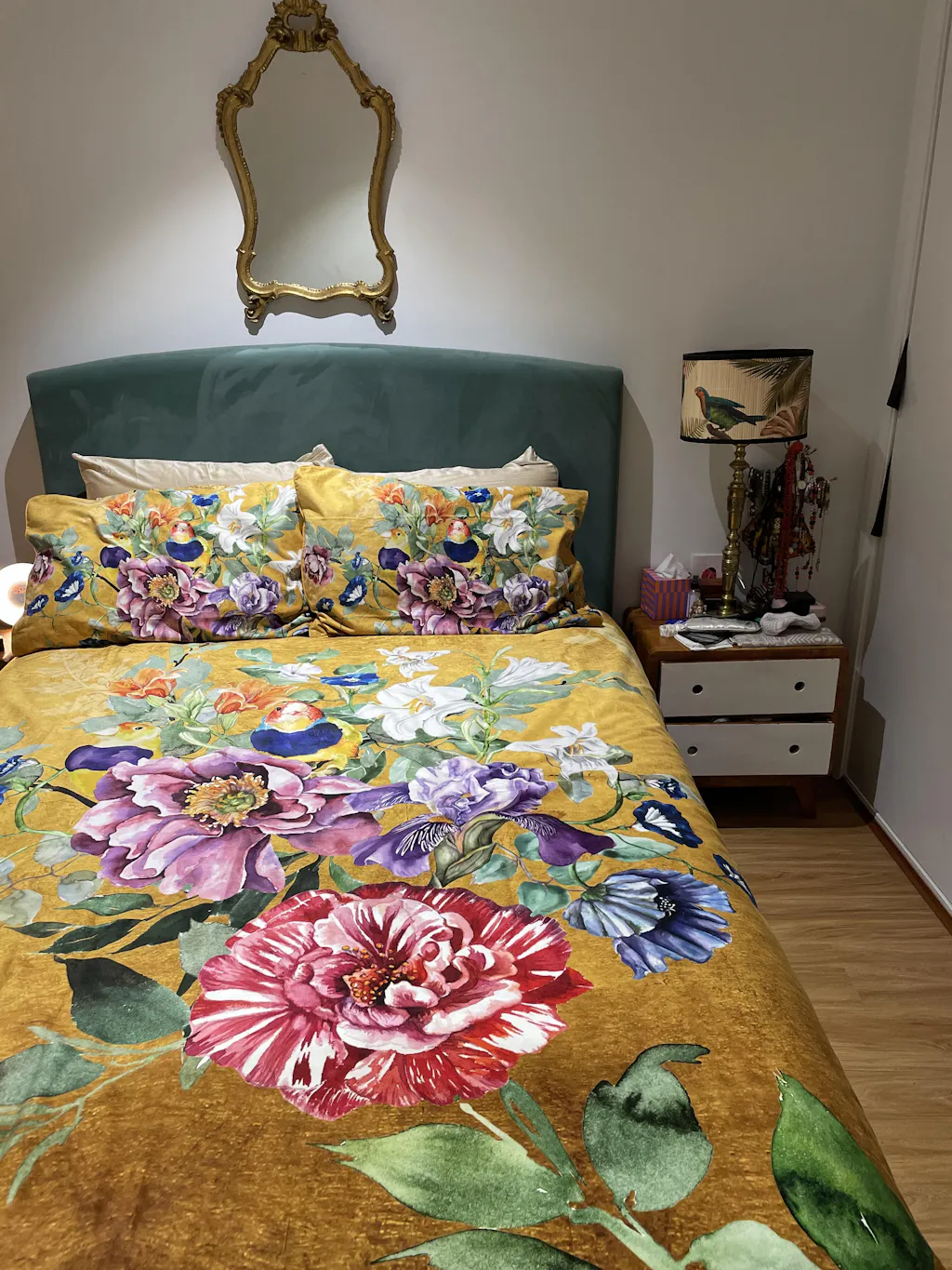
Dense botanical patterning in warm ochre, earth, and gold tones on cotton sateen. Visually rich and tonally warm, designed to anchor a bedroom that uses natural materials and matte surfaces throughout.
Shop Marceline Mustard →
Marceline Mustard Quilt Cover Set — 3/4 view with full pillow styling, showing the dense botanical artwork across the cotton sateen surface in a warm, grounded palette. Shop Marceline Mustard →
The Room That You Feel
There is a version of the well-designed bedroom that exists only as an image: resolved, beautiful, and entirely at home on a screen. And there is a different version, the one that is the actual point, that exists in three dimensions and registers on every sense available when you walk into it. The gap between these two versions is, more often than not, a texture gap.
Filling that gap is not complicated, but it requires a different starting question. Not "what colour should the room be?" but "what do I want this room to feel like, and what materials will produce that feeling?" The answer almost always begins with the bed, with the surface you will spend more time in contact with than any other in the house, and with the question of whether what you put on it was chosen for its material quality or simply for how it looks from a distance.
The bedroom that stays with you is the one you can feel as much as see. Texture is how that feeling is made. It is the dimension of design that most honestly engages the whole person, not just the eye, and the one that most consistently separates the room that photographs well from the room that is actually, in the fullest sense, worth being in.