How to Style Expressive Bedding Without Overwhelming a Space
Expressive bedding has presence. Colour, pattern, and artwork naturally draw the eye, which is precisely why it can feel intimidating to style. Many people love the idea of statement bedding but worry it will dominate the room or feel visually busy once it is on the bed.
The truth is that expressive bedding does not overwhelm a space on its own. It only does so when the surrounding elements are not given equal consideration. When styled with intention, bold bedding becomes a grounding focal point rather than visual noise.
This is less about rules and more about balance, restraint, and understanding how the bedroom is experienced as a whole.
Let the bed lead the story
In most bedrooms, the bed is already the largest visual surface. Trying to make it disappear often creates more tension than letting it lead.
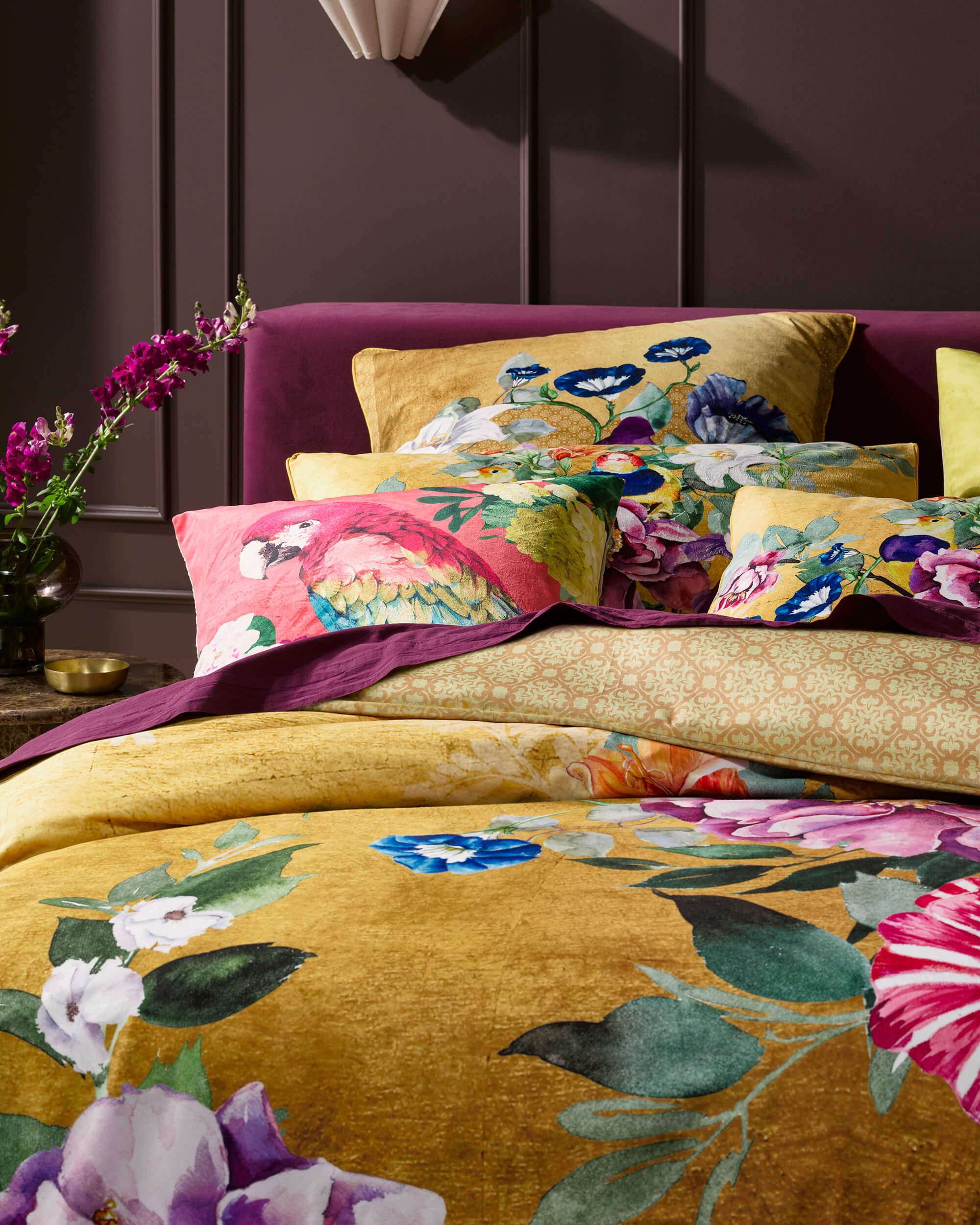
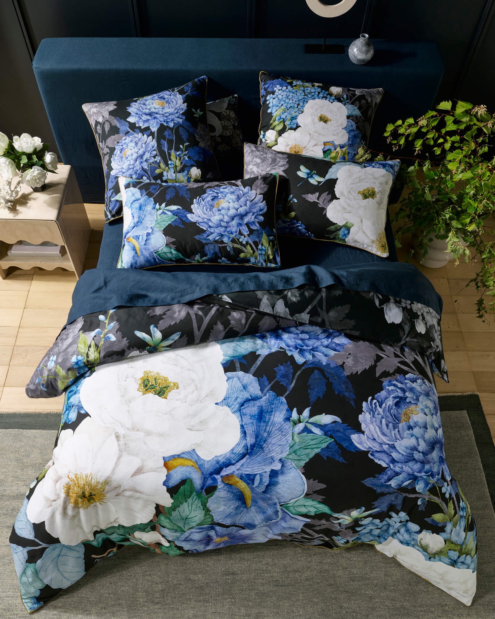
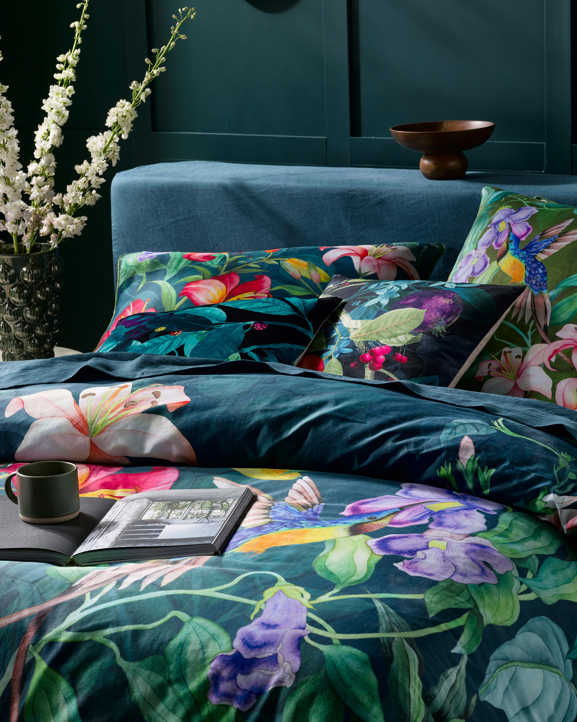
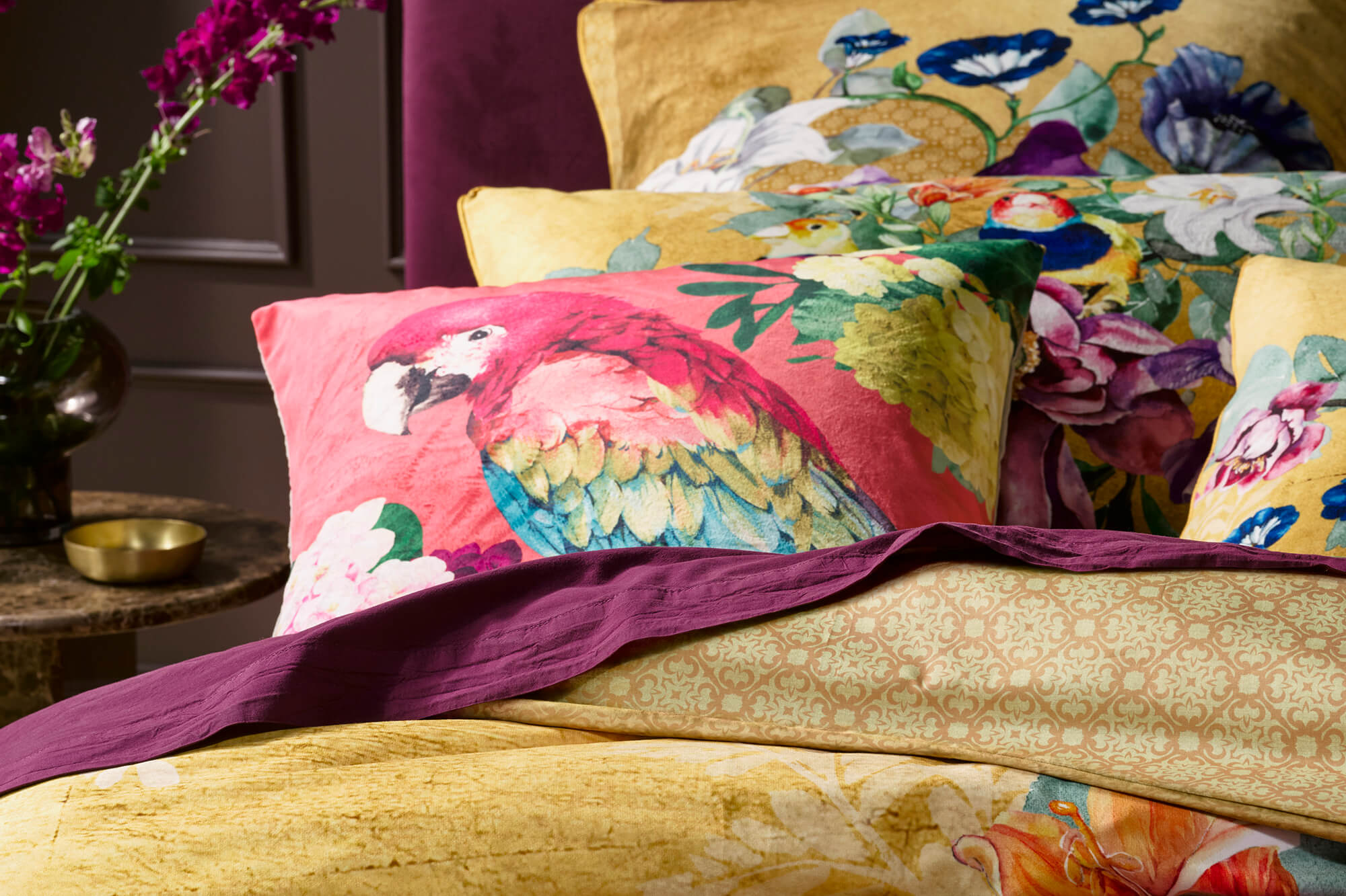
Expressive bedding works best when it is allowed to anchor the room. This means resisting the urge to compete with it. When the bed holds the strongest visual voice, everything else can soften.
Rather than scattering pattern throughout the space, allow the bedding to carry the narrative. This creates clarity and gives the eye a place to rest.

Use colour to create breathing room
Colour is not just about what stands out. It is also about what recedes.
When bedding features layered colour or hand-painted pattern, surrounding tones should support rather than echo it exactly. Pulling one or two quieter shades from the design and using them elsewhere in the room creates cohesion without repetition.
Walls, rugs, and window treatments work best when they feel calm and resolved. Neutral does not have to mean pale or minimal. Soft clays, warm stone tones, muted greys, or gentle chalky whites all provide space for expressive bedding to breathe.

Limit pattern elsewhere
One of the simplest ways to avoid visual overwhelm is to be selective with pattern placement.
If the bedding is patterned, let other surfaces remain textural rather than decorative. Linen curtains, timber furniture, ceramic lamps, or woven rugs introduce interest without adding competing imagery.
This contrast allows the artwork on the bed to feel intentional rather than excessive.
| Balanced expression | Visually overwhelming |
|---|---|
| Bed is the focal point | Multiple competing focal points |
| Pattern lives mainly on the bedding | Pattern repeats across bedding, rug, curtains, and cushions |
| 1–2 supporting tones pulled from the artwork | Several bold colours echoed throughout the room |
| Textural accents (linen, timber, ceramic, woven) | Decorative accents with extra motifs and busy detail |
| Clear negative space on surfaces and around the bed | Every corner and surface filled “just because” |
Think in layers, not statements
Expressive spaces are rarely built from single, loud gestures. They are layered gradually.
Bedding itself can be layered thoughtfully. A patterned duvet paired with simpler pillowcases. A solid throw folded loosely at the foot of the bed. Subtle variation in texture rather than additional colour.
Each layer should feel connected but not identical. This creates depth without density.
Consider scale and proportion
Scale matters as much as colour or pattern.
Large-scale patterns often feel calmer than small, busy repeats because the eye can take them in more slowly. This is especially true in bedrooms, where restfulness is key.
Furniture and accessories should respect this scale. Clean-lined bedside tables, generous negative space around the bed, and lighting that is sculptural rather than intricate all help maintain balance.
Let negative space do some of the work
Negative space is not emptiness. It is pause.
Leaving areas of the room intentionally quiet gives expressive elements room to resonate. This might mean fewer cushions, clearer surfaces, or resisting the urge to fill every corner.
In bedrooms, restraint often reads as confidence.
Light changes everything
Lighting determines how colour and pattern are perceived.
Soft, warm light reveals depth and softness in expressive bedding, while harsh overhead lighting can flatten it. Bedside lamps, wall sconces, or diffused lighting sources allow patterns to unfold gently rather than demand attention.
Evening light, in particular, is where expressive bedding often feels most at home.

Styling for feeling, not perfection
An expressive bedroom should feel lived in, not staged.
Beds that are slightly undone, layers that move naturally, and spaces that invite touch tend to feel calmer than overly styled arrangements. Expressive bedding looks its best when it feels part of daily life rather than an object to be preserved.
Luxotic’s Signature Series designs are created with this in mind. Hand-painted artwork, layered colour, and considered composition allow the bedding to hold presence without rigidity.
When expression feels effortless
When expressive bedding is styled well, the room does not feel louder. It feels more resolved.
The bed becomes a centre of gravity. The space feels intentional, personal, and complete.
Styling expressive bedding is not about toning it down. It is about giving it the space and support it needs to belong.
When the balance is right, colour and pattern stop competing for attention and begin to shape atmosphere.
And that is when a bedroom feels not only beautiful, but genuinely restorative.
If you remember only three things:
-
Let the bed lead
-
Repeat colour, not pattern
-
Protect negative space
