The Language of Colour in the Bedroom
Colour is not decoration. In the bedroom, it is atmosphere - shaping how a space feels before you ever touch the bed.
Colour is often treated as a finishing touch - something chosen at the end, once the furniture is placed and the bigger decisions are made. But in the bedroom, colour does not come last. It comes first. It is the atmosphere you walk into before your eyes have settled on anything specific.
It shapes how the body responds, how the mind slows down, and how the transition from day to night begins to happen without effort. Colour speaks quietly, but it speaks before anything else does.
In bedrooms that genuinely support rest, colour is not accidental. It is one of the most deliberate choices in the room.


Two moods, both restful. Light and dark palettes each support sleep — what matters is coherence and intention.
Colour as an emotional cue
Before we analyse colour, we feel it. The nervous system registers tone, depth, and contrast long before the analytical mind forms an opinion. This is not poetic - it is physiological.
Soft, layered colours tend to slow the body down. They create a visual sense of enclosure, a signal to the nervous system that the pace can soften. Deeper hues feel grounding. Lighter palettes feel open and restorative. Neither is inherently better - what matters is how the colour behaves in your specific space.
The question is not whether a colour is light or dark, warm or cool. It is whether it invites the eye to linger, or nudges it to keep scanning. In the bedroom, stillness is the goal.
Moving beyond "calming colours"
The assumption that bedrooms must be pale, neutral, or minimal has become its own kind of design anxiety. Calm does not live exclusively in beige. It does not require white walls or a stripped-back palette to exist.
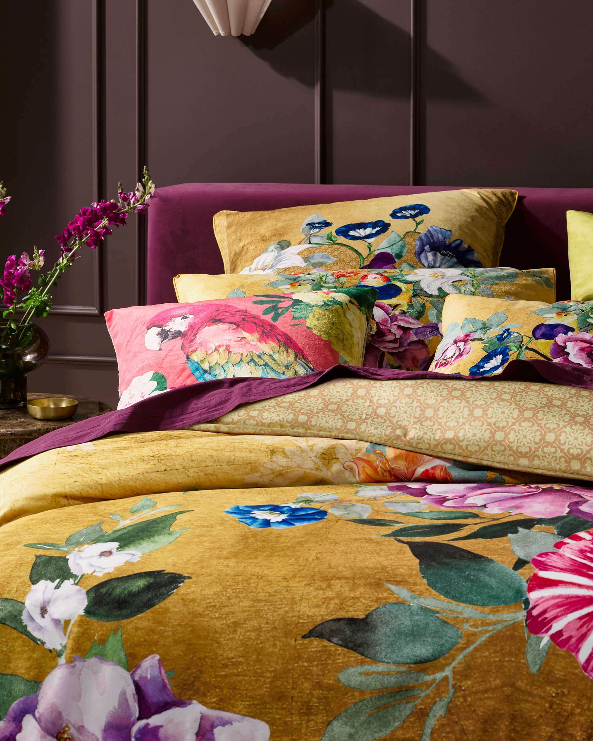
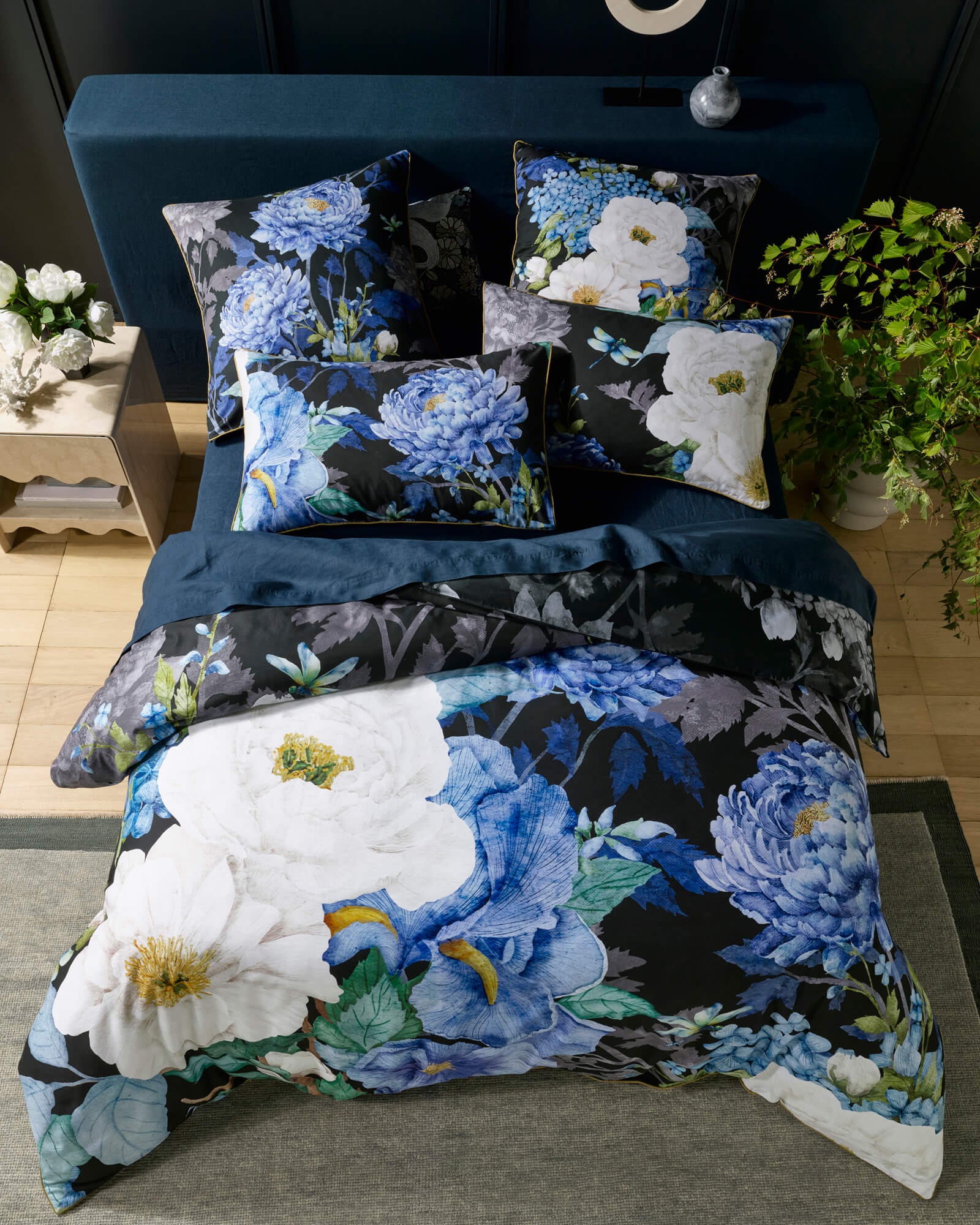
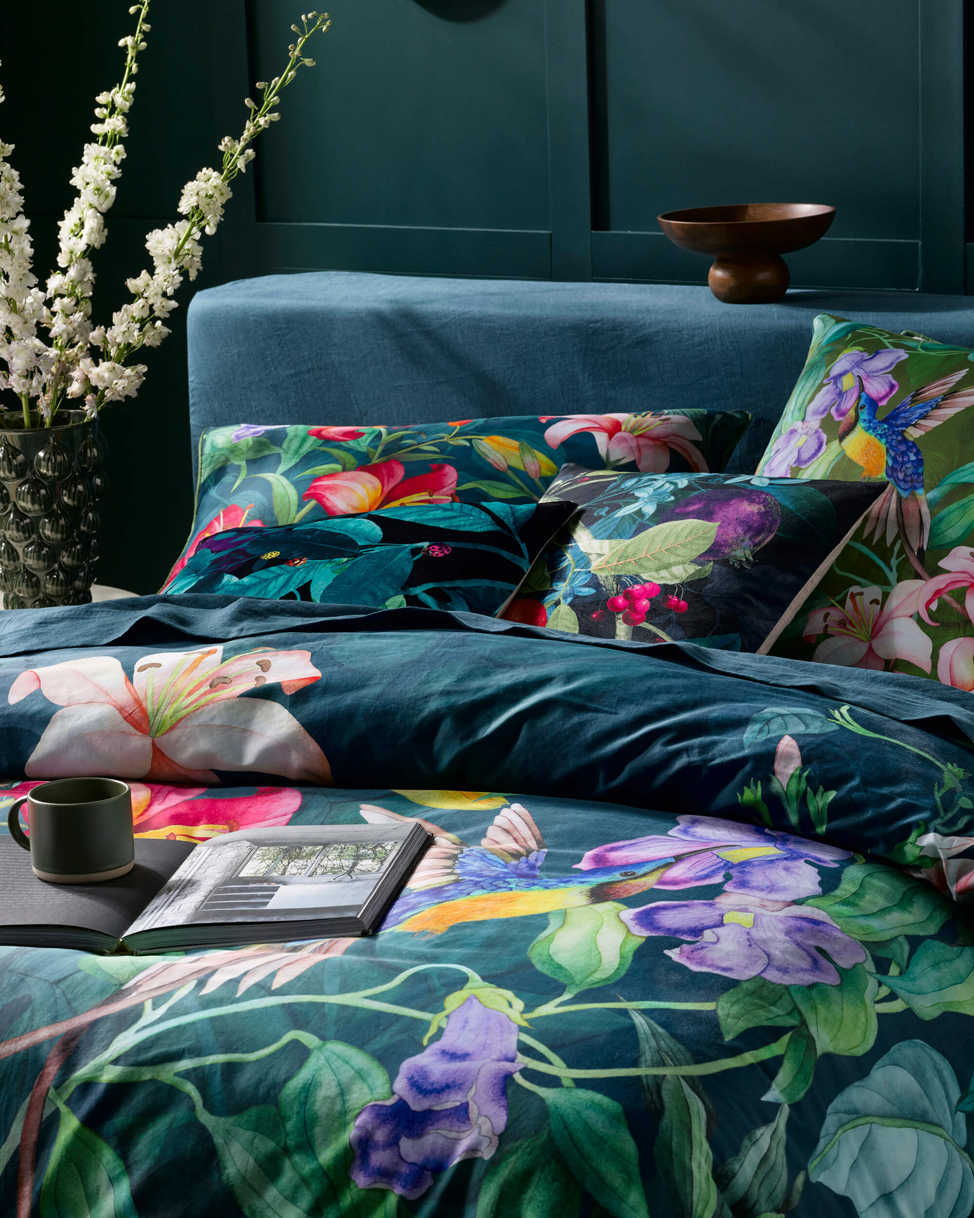
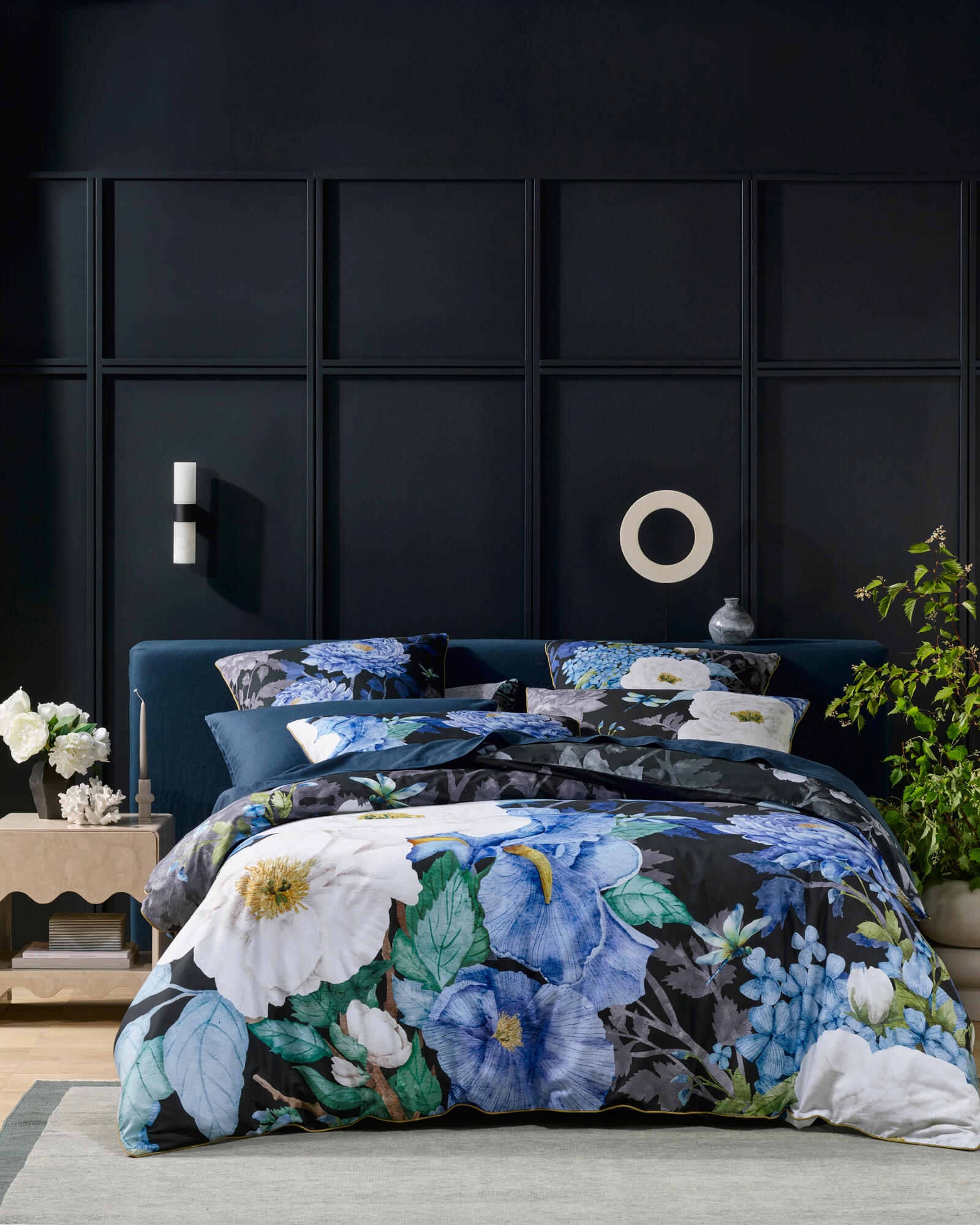
For some people, calm is found in muted botanicals, washed florals, or layered greens that echo something natural. For others, it appears in inky blues, deep clay tones, or moody charcoals that feel enveloping rather than heavy. Both are valid. Both can support rest.
Rest comes from coherence, not restraint. When colour feels resolved - when it belongs - the mind stops questioning the space.
The most restful bedrooms are not always the quietest visually. They are the ones where the colour choices feel intentional, where nothing is fighting for attention and everything sits in the right relationship to everything else.
How light changes the room
A bedroom is not experienced in a single moment. It moves through morning light, afternoon sun, and lamplight at night. Colours that work well in bedrooms tend to have depth - they shift subtly as light changes, revealing softness in the evening and clarity in the morning.
Flat, overly saturated colours can feel harsh at night, even if they look appealing during the day. This is one reason why layered colour stories matter more than single-note palettes. They allow the room to evolve with time rather than fight it.

Pattern as a way of holding colour
Pattern gives colour context. It introduces rhythm and variation, allowing multiple tones to coexist in the same surface without competing. Where a solid fabric carries a single note, a considered pattern creates a conversation between colours.
Hand-painted patterns carry something that digital or mechanically repeated patterns do not: irregularity. The colour moves through them rather than sitting on the surface. Lines vary slightly. Tones shift within a single brushstroke. This movement, in a bedroom setting, is grounding rather than stimulating. It gives the eye somewhere to rest.
Within the Luxotic Signature Series, colour and pattern are developed as inseparable. Each design is built as a composition rather than a repeat - which is why the bedding reads as expressive without demanding attention.

Choosing colour for how you want to feel
Rather than asking what colour is "right" for a bedroom, a more useful question is how you want the space to feel when you enter it at night. The answers tend to guide colour more accurately than any trend forecast.
The role of restraint
Expressive colour does not mean excess. Restraint is often what makes colour feel luxurious in the first place. Allowing one colour story to lead - supported by quieter tones - gives the space clarity and prevents the visual noise that makes a room feel tiring rather than restful.
This is where bedding plays a central role. As the largest visual surface in the room, it anchors the palette. When the bed feels resolved, the rest of the room can soften around it.
Colour as part of a nightly ritual
Over time, colour becomes habitual. The tones you see as you turn down the lights. The pattern you notice in stillness before sleep. The familiarity of a palette that signals the day is done. These cues matter more than most people realise - they help the body transition without any conscious effort.
When colour is chosen with care, it does not just style a bedroom. It shapes the rhythm of rest itself.
The most beautiful bedrooms are not the ones that follow rules. They are the ones that feel understood.
There are no formulas for bedroom colour. What lasts is intention - colour chosen for atmosphere rather than approval, pattern chosen for feeling rather than trend. The Luxotic approach to colour is expressive without being domineering. Not to take over the room, but to complete it.

