The Art of the Unmade Bed
There is a particular kind of bedroom that stops you. Not because the bed is perfectly made, corners hospital-tucked, pillows arranged with geometric precision, but because it looks like someone actually sleeps there. A quilt pulled softly toward the headboard. A fold catching the morning light. The unhurried quality of fabric that has simply been allowed to rest.
We have spent decades being told that a made bed is a sign of a well-ordered life. It sits in productivity mantras and self-help literature as shorthand for discipline. But somewhere in that framing, the bedroom itself got lost. It became a performance space, a surface to be arranged for invisible judges, rather than the most personal room in the home.
The most beautiful bedrooms, the ones that genuinely make you want to sink into them, almost never look like hotel rooms. They carry a quality that is harder to name than perfection. Call it ease. Call it the visual signature of a space that is lived in and loved. And it is almost always, in some small way, slightly undone.
Why Perfection Feels Distant
There is a reason designers refer to visual tension when describing spaces that feel unwelcoming. A bed smoothed into rigid symmetry creates exactly that. The eye finds nothing soft to rest on. Every edge is resolved. Every fold has been erased. The result is technically correct and emotionally inert.
Interior photographers have understood this for years. When styling a bedroom for a shoot, the first thing a good stylist does after the meticulous arrangement is to slightly undo it. Pull one corner of the quilt back. Ease a pillow out of perfect alignment. Let the fabric breathe. These small acts of deliberate imperfection are what transform a showroom into a room.
The psychological explanation is straightforward. Spaces that appear too finished signal to the nervous system that they are not meant to be occupied. The perfectly pressed, tightly tucked bed is a surface for display, not for rest. When the bedding is softened, the body reads the space differently. It relaxes before you have even sat down.
This is worth sitting with, especially if you have ever felt vaguely uncomfortable in a bedroom that looked, objectively, beautiful. The discomfort is not a failure of taste. It is the room working exactly as its rigid styling intended, keeping you at arm's length rather than drawing you in.

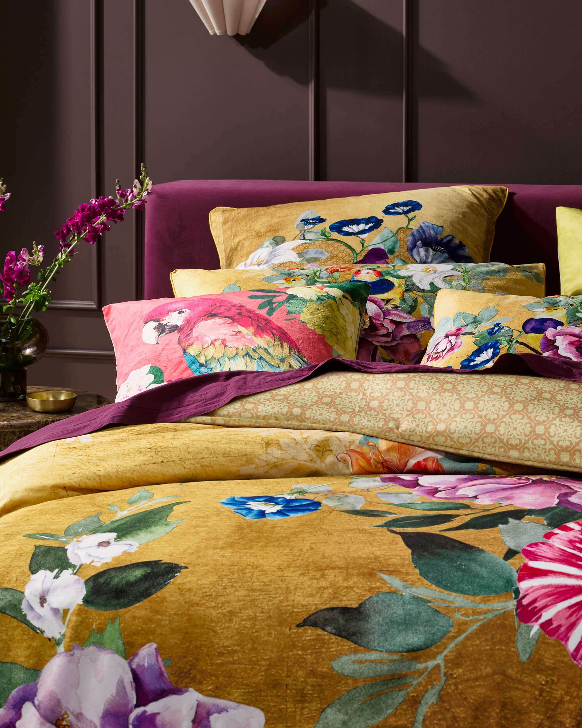
Azura Selva Quilt Cover Set — lifestyle detail showing the tropical botanical artwork in its natural, relaxed arrangement. Shop Azura Selva →
Visual Softness as a Design Strategy
The concept of visual softness is one of the more underrated tools in interior design. It refers to the quality of a space where the eye moves through the room rather than stopping at hard edges. Curved forms, layered textiles, natural materials, surfaces that absorb light rather than reflect it. In the bedroom, fabric is the primary medium for this, and the bed is where it plays out most fully.
When a quilt is draped rather than stretched, it creates a series of soft ridges across the surface. These ridges cast small shadows. The shadows add depth. Depth makes the surface more interesting to look at. None of this requires a deliberately decorated room. It is what happens when good fabric is simply allowed to exist as fabric does.
Designers in the Scandinavian and Japanese traditions have long prioritised this kind of softness, building entire interior philosophies around the idea that a space should feel inhabited rather than installed. The Danish concept of hygge, for all its overuse in lifestyle media, points to something real: the atmospheric quality of warmth, texture, and ease that makes a space feel worth staying in.
For bedrooms specifically, this softness carries additional weight. The bedroom is where you begin and end each day. It is the room that sees you at your most private, your most unguarded. A space that feels rigid is not just aesthetically off. It is practically wrong. The bed is where you rest, and a bed that performs ease rather than embodies it offers a very different kind of welcome.
The Fabric That Makes It Possible
Not every bedding drapes the same way, and this matters more than most people account for when they are choosing what to sleep under. Fabric with a high synthetic content or a heavy, stiff weave resists natural folds. It holds the shape it is placed in, which can look structured and flat. Fabric with the right weight and surface quality does something different. It settles. It responds to movement and gravity with the kind of natural flow that makes an arrangement look effortless even when it is not.
Cotton sateen sits on the right side of this equation. Its weave, characterised by a higher thread count and a smooth surface sheen, gives it a weight and drape that most bedding fabrics cannot match. It moves like fabric should move. When a sateen quilt cover is pulled across a bed, it does not resist or bunch in hard angles. It falls into folds that feel considered even when they are entirely accidental.
This is particularly important for designs that carry significant visual detail. A print on stiff polyester becomes flattened, the pattern sitting on the surface without dimension. The same design on cotton sateen is different. The fabric's natural drape creates soft relief across the pattern, depth at every fold, shadow at every ridge. The artwork is not just displayed. It is animated by the way the fabric behaves.
The Signature Series from LUXOTIC begins as hand-painted original artwork before being translated onto cotton sateen. Each design, from the lush tropicals of Azura Selva to the layered motifs of Aria, was conceived with the fabric's surface in mind. The luminosity of the sateen and the richness of the hand-painted colour were developed together. Which means a relaxed bed, one that has been draped and settled rather than stretched and smoothed, is not a departure from how these designs are meant to be seen. It is closer to how they were designed to be seen.

Aria Black Quilt Cover Set — close-up detail of the hand-painted animal motif, showing how the artwork reads across the cotton sateen surface. Shop Aria Black →
Relaxed, Not Careless
There is an important distinction worth making here, because the aesthetic of the unmade bed is often misread as simply the absence of effort. It is not. The relaxed bed is a considered result. It has been approached with an eye for how fabric moves, how layers relate to each other, and how much is enough. The difference between a beautifully relaxed bed and one that just was not made is intention, even when that intention is invisible in the finished arrangement.
The practical logic of relaxed styling begins with layers. A single flat quilt cannot achieve what a properly layered bed can. The base sheet provides foundation. The quilt cover carries the design. Euro pillowcases sit behind and above the standard pillows, providing height and a frame for the arrangement. When these layers work together, even a loose arrangement has structure. The eye reads the layers, understands the relationships, and experiences the whole as composed rather than chaotic.
The quilt fold, or turn-back, is one of the most effective single gestures in bedroom styling. Folding the top edge of the quilt down by roughly a quarter of its length creates a horizontal line across the upper section of the bed. It reveals the interior of the cover or a contrasting sheet beneath. It breaks the single flat plane of the quilt into two surfaces, adding visual interest without any additional decoration. And it signals, quietly, that this bed is ready to be climbed into.
From there, the pillows are what carry the detail. Standard pillows can be propped rather than laid flat, creating height and allowing the design on their cases to show properly. Euro pillowcases, standing square behind the standards, act as a backdrop that gives the entire arrangement depth. The whole composition, viewed from the doorway, should feel like something that happened naturally rather than something that was assembled, even though it was.
| The Relaxed and Intentional Bed | The Hotel-Flat and Rigid Bed |
|---|---|
| Quilt pulled softly toward the headboard, folded back a quarter | Quilt stretched tight to the mattress edge, corners precisely tucked |
| Pillows layered and slightly offset, showing height and depth | Pillows aligned in a flat row, karate-chopped into uniformity |
| Fabric folds create shadow and movement across the design | Surface is smooth and flat, pattern reads without dimension |
| Room feels: warm, personal, ready to inhabit | Room feels: polished, distant, staged for display |
| What it communicates: this is where someone lives | What it communicates: this is where no one sits down |
When the Pattern Finds the Light
One of the underappreciated qualities of a well-designed bedding print is how differently it reads at different points across the surface of a relaxed bed. A design that appears one way when viewed flat on a screen becomes something else entirely when it is on the bed, folded and draped and lit by whatever light is in the room that morning.
This is particularly true for hand-painted designs, where the original brushwork carries variations in tone and weight that a digitally created pattern cannot replicate. At a fold, where the fabric curves away from the light, colours deepen. At a ridge, where the sateen surface catches the light at a shallower angle, the same colour appears lighter, almost luminous. The design is not static. It moves across the surface with the fabric, and the relaxed bed is the state in which this movement is most fully expressed.
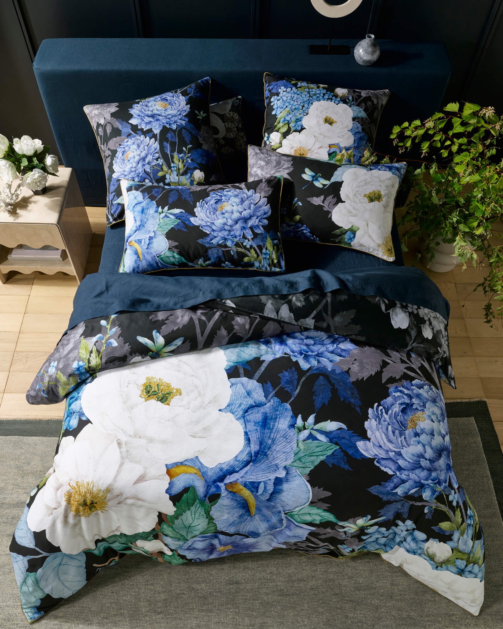
Consider Marceline Black, with its dense botanical patterning set against a deep ink ground. On a tightly made bed, the design reads as a pattern. On a relaxed bed, the same design reads as something closer to a painting. The folds create dimension. Dark tones recede. Lighter brushwork catches the light. What was flat becomes atmospheric.
The most revealing thing you can do for a hand-painted design is let it rest naturally on the bed. That is when the artwork becomes three-dimensional, when the brushwork stops being a surface and starts being a landscape.
The same principle holds across the range. Marceline Mustard carries the same botanical forms in a warm ochre and earth palette that shifts tonally with every fold. Jungle Lotus has a botanical density that reveals different layers of its composition depending on where the fabric lies. Gold Leaf catches the light in a way that changes entirely between morning and evening, the hand-painted gold and warm botanical forms shifting from bright to deep as the room's light changes through the day.

Marceline Black Quilt Cover Set — lifestyle detail showing the deep botanical patterning at rest. Shop Marceline Black →

Marceline Mustard Quilt Cover Set — the same botanical forms in a warm ochre palette, with its own tonal depth in the folds. Shop Marceline Mustard →
The Room That Follows the Bed
Once you accept the bed as the centrepiece of the bedroom, the rest of the room becomes easier to design. This is one of the practical arguments for investing in bedding you genuinely love: when the bed carries visual weight, everything else can be simplified. Walls can be plain. Furniture can be minimal. Decorative objects can be spare. The bed does the work.
A relaxed bed does this more effectively than a rigid one, because a rigid bed demands visual equivalents throughout the room. When every surface is tight and controlled, the eye looks for relief and finds it uncomfortable when there is none. When the bed is soft and layered and slightly undone, the room relaxes with it. The spare bedside table does not look stark. It looks considered. The plain wall does not look unfinished. It looks like a quiet backdrop for the thing in front of it.
This is the underlying logic of the bedroom-as-sanctuary approach that has become the dominant aesthetic in contemporary interior design: that the bedroom should feel like a withdrawal from the visual noise of the rest of life, not a continuation of it. The bed, in that context, is not the most decorated element. It is the most important one. And a bed that feels genuinely alive, that has fabric that moves and colour that shifts and a design that reveals itself differently each time you look at it, creates that sanctuary without needing anything else to complete it.
Azura Selva
A lush tropical world of hand-painted hummingbirds, flowering botanicals, and deep jungle canopy. Warm and enveloping on a relaxed bed.
Shop Azura Selva →Gold Leaf
Floral and avian motifs rendered in warm gold and botanical tones. A design that shifts between richness and lightness as the room's light changes through the day.
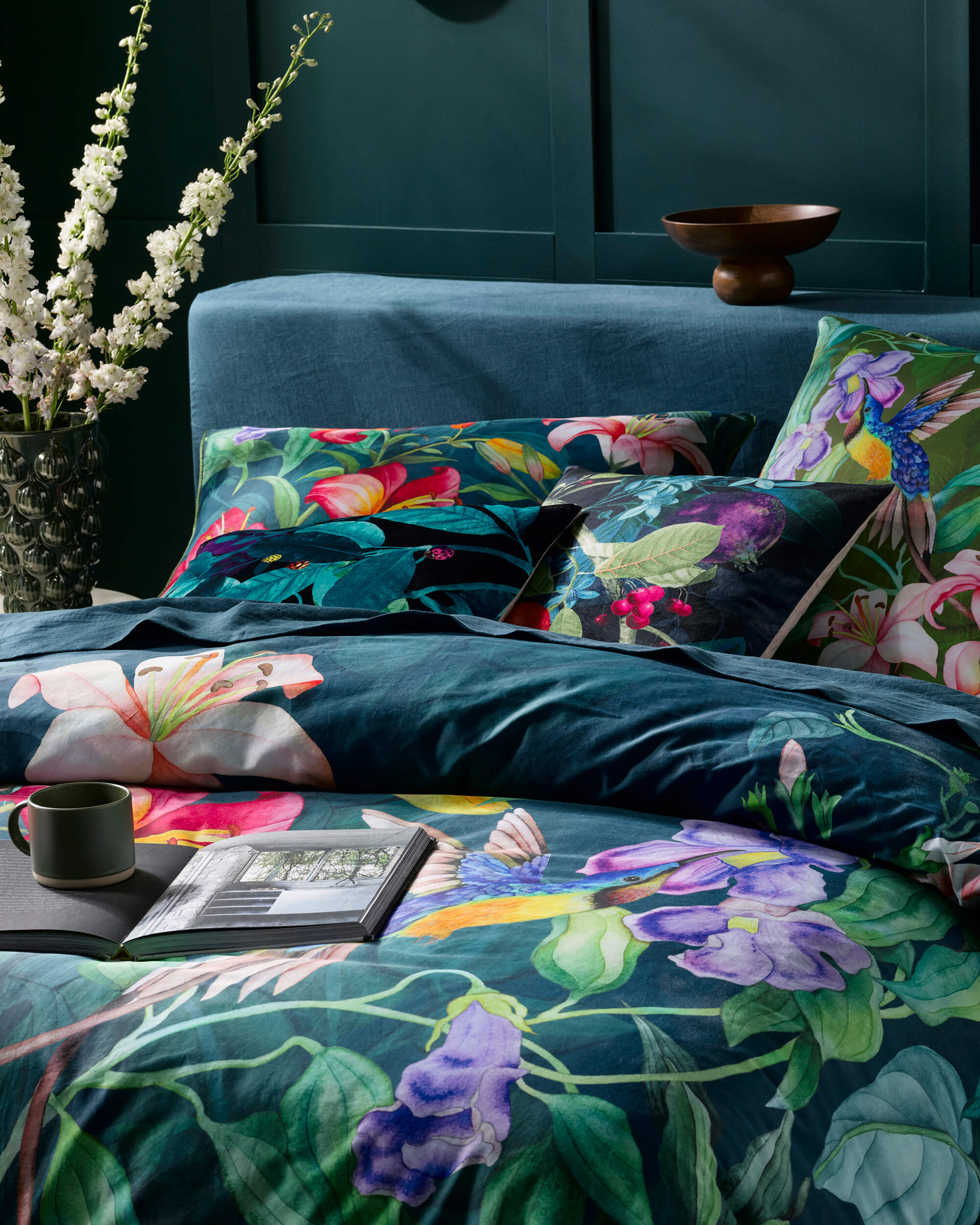
Shop Gold Leaf →Jungle Lotus
A botanical composition of remarkable density: lotus flowers and jungle foliage layered into a design that rewards a relaxed drape, where different elements emerge with every fold.
Shop Jungle Lotus →
Gold Leaf Quilt Cover Set — 3/4 view showing the full bed styled with euro pillowcases, illustrating how the botanical and avian motifs settle across the surface. Shop Gold Leaf →
Allowing Design to Breathe
There is a version of bedroom design that treats the bed as a problem to be solved, a large awkward surface that needs to be managed with enough pillows and styling until it finally behaves. And there is a different version, one that treats the bed as the starting point, the most expressive surface in the room, and allows everything else to follow from it.
The unmade bed, in its fullest sense, belongs to the second version. It is not about abandoning care. It is about directing that care toward atmosphere rather than order, toward the warmth and ease that make a space feel genuinely worth returning to at the end of the day. When the bedding carries real design, real colour, real artwork born from a hand-painted original, there is nothing to lose by letting it rest naturally. The design does not need to be pressed into submission. It needs room to live.
The most beautiful beds are often the ones that feel just slightly undone. Not because imperfection is charming in itself, but because the slightly undone bed is honest about what a bedroom is actually for. It is not for display. It is for the person who sleeps there. And a bed arranged with that truth in mind, soft and layered and alive with colour that shifts in the morning light, is a very fine place to begin and end a day.
